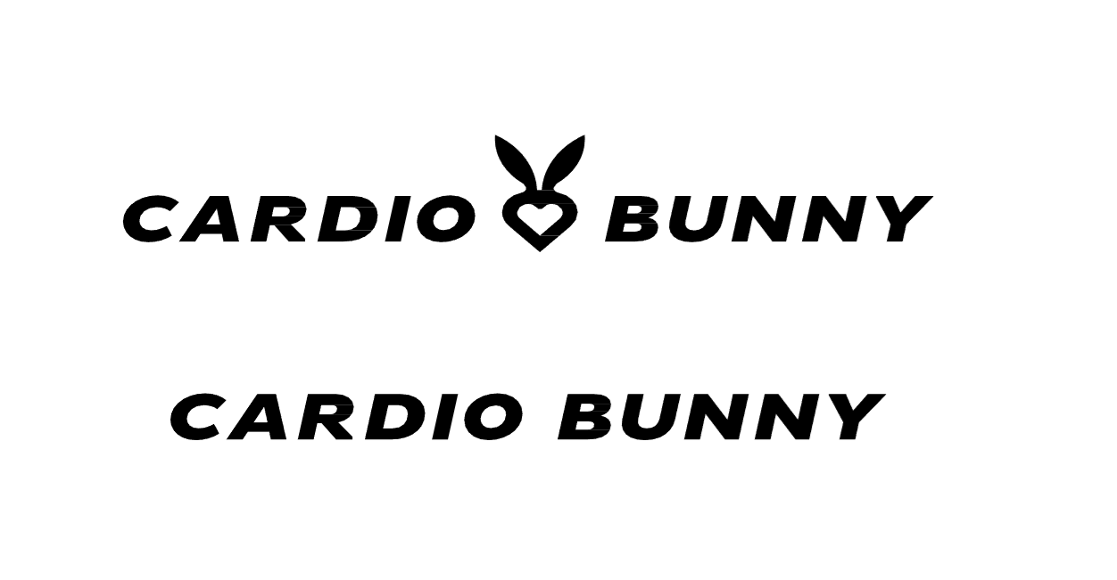
The logo exists in two primary formats, both featuring the brand’s core elements: typography and signet ring. Additionally, a standalone logotype is also available for use.
Strictly adhere to the original design of the logo, including its form, colors, and arrangement. Ensure that the logo is always positioned within a protective field that maintains its integrity.
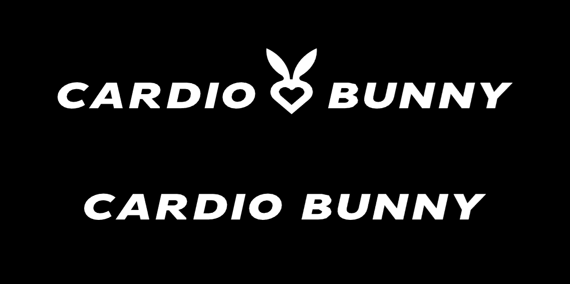
Both versions of the logo can be inverted to negative, ensuring consistent visual communication across various applications..
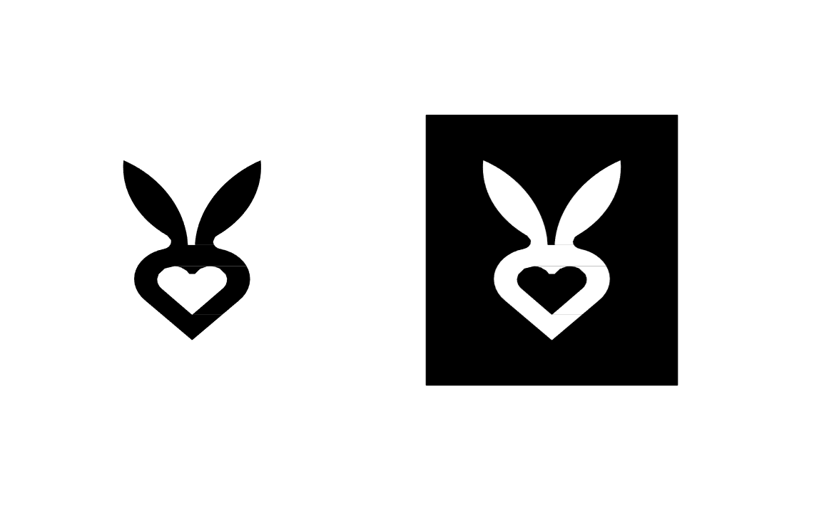
The signet ring is a recognized visual representation of the brand, yet it’s not intrinsically linked to the logo’s structure.
It can be featured independently or integrated with the logo.
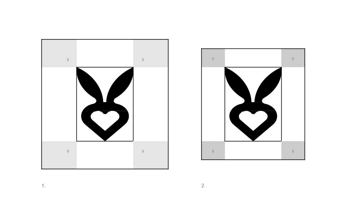
The protective and minimum field is determined by the size “y”, which is equal to 1/4 of the height of the signet itself.
- The protective field determines the minimum distance of the sign from other graphic elements such as photos or text fields. This rule mainly applies to elements created on external materials.
- The minimum field determines the distance of the sign from other graphic elements such as photos or text fields only on its own materials.
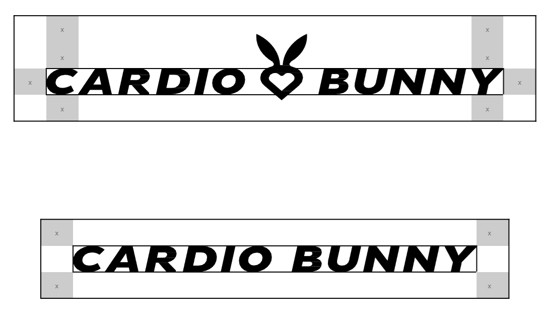
The protective field is determined by the size “x”, which is equal to the height of the letter “B” in the logo.
It determines the minimum distance of the sign from other graphic elements such as photos or text fields.
This rule mainly applies to elements created on external materials.
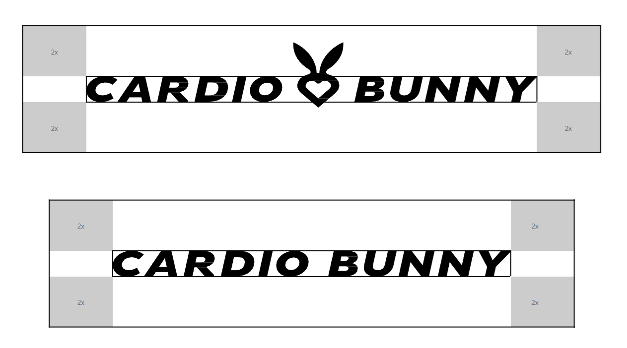
The minimum area is determined by the size “x”, which is equal to the height of the letter “B” in the logo.
It determines the minimum distance of the sign from other graphic elements such as photos or text fields only on proprietary materials.
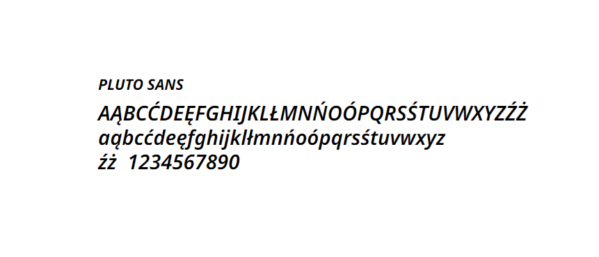
The logo was created using the PLUTO SANS font. We use this typeface in headlines and slogans of advertising and promotional materials.
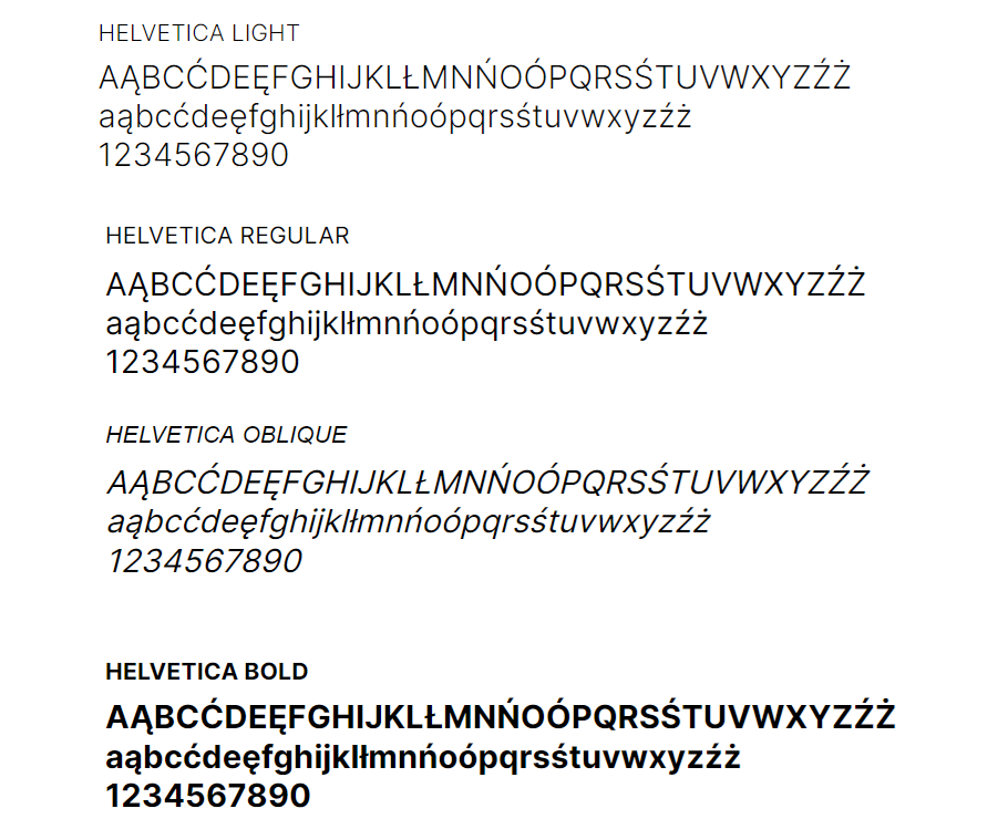
The second permissible typeface is Helvetica, which comes in four varieties: Light, Regular, Oblique and Bold.
We use this font in text blocks and in places where it is impossible to use a standard font
